

Max Humphrey and I are in the beginning stages of co-designing this new river house (along with our architect Annie Usher) and boy do we have different design processes. It should be noted that Max was in a punk band before he worked for a big design firm in LA and he’s had so many speeding tickets (as a 40-year-old dad) that he currently isn’t allowed to drive between midnight and 5 am. So that gives you some insight into how he navigates life – however he wants to. The way he approaches a renovation is SO DIFFERENT than me, and I thought that I was a design rebel, being formerly “untrained”. He does whatever he wants to whenever he wants and it’s WILD to witness. I feel like I used to do this in decorating but my love of ALL styles made my homes too chaotic (especially before the Glendale home) so when it comes to renovation and picking permanent finishes, I HAVE to have my process in order for it to look cohesive. Anyway, it’s all to say that where I begin (pinning an overall look and feel, setting the vibe and style for the whole art direction) he DOES NOT. It was totally baffling at first. Luckily, we have GREAT working chemistry and neither of us have much of an ego, so it is so fun to work with him and witness his process – but it’s SO DIFFERENT than mine (and so similar to the style diagnostic!) and yet it totally works!!! Anyway, Max, you punk, take it away and teach the people how you design totally backwards (IMHO). ALSO, BUY HIS NEW BOOK BECAUSE IT IS SO GOOD.
Hi it’s your new friend of the blog Max Humphrey, Emily’s co-interior-designer on the River House project and recent author of the book Modern Americana. Emily said we need to do a River House post and it was my turn so here we go. I’m supposed to be talking about my design process in this post but I’m procrastinating. Writing blog posts is super hard btw I don’t know how Emily and her peeps churn these out every other day. I’m turning this post in a day after, two days after, three days after EHD editorial director Jess said it was due, sorry Jess!
I joined the River House team a little after the project kicked off. When Emily gave me the whole download she invited me to a secret Pinterest board shared with Em, architect Annie Usher, and our “clients” aka Emily’s brother and sister-in-law Ken and Katie. On this secret board, there are THREE HUNDRED AND FIFTY pinned images and all of them are super awesome but in my own design process I tend to start backwards by sourcing specific items and specs and building homes up piece by piece and THEN maybe eventually ending up with inspiration to reference. I like to go shopping first and pick some tile, then source a few key plumbing fixtures, a pendant light or sconce or two, get flooring samples, eyeball some bathtubs and shower, door hinges, doorknobs, garbage disposal buttons and on and on and on until we have a whole house worth of stuff picked out. I don’t think about if things go together, I only think about if we love each piece individually. It all goes together because we say it goes together. Colors don’t clash. Hardware finishes don’t need to be matchy-matchy. We can mix art deco with mid-century modern with industrial and arts and crafts if we want. Some of the clients I work with love this approach because they feel very involved in the process and we can pinpoint exactly when and where we selected each item together. This way there’s a journey from beginning to end. Some clients don’t love this process and say things like, “we like this tile sample or chair you’re showing us but we don’t see how it fits in with THE BIG PICTURE.” That’s usually when we figure out we’re not a good design/client match and this is why I charge hourly instead of having a flat fee.

I relate my design process to clothing shopping. How often do you go buy an entire outfit (pants, shirt, shoes, socks, jacket, hat, bag, whatever) from one single store and wear all of it together? Probably never. When I buy clothes it’s because I need a pair of pants for some reason, so I get some pants and wear them with a shirt I already own and then maybe get a sweater a few months later when it’s colder and it’s usually from a different store by a different brand than the rest of the stuff. If you get the J.Crew catalog in the mail or walk past one of the storefronts and try and recreate the exact outfit the mannequins have on, it never looks as cool because those are mannequins. Same deal with designing a house by starting out with inspiration – you’ll almost never get what you want because that’s not your house. I got an ad on Instagram recently for an L.L.Bean camo sweatshirt with Snoopy on it that I HAD TO HAVE, even though I had no idea what I’ll wear it with. And I found some cool vintage chrome chairs on craigslist the other day that I know will be perfect for a remodel project I’m designing in Lake Tahoe but I don’t know which room they’ll go in yet or what fabric I’ll use to reupholster them in. I just know that they’re cool and I’ll make them work.


Designing For Myself
I try to design for clients the same way I design for myself. It’s no surprise that most people respond to projects on interior designers’ portfolios that are the designer’s own homes. For my own house, I buy one thing at a time as my budget allows, constantly reuse and move stuff from one room to another, do little DIY projects here and there, hire contractors when I’m out of my depth, and figure things out as I go. I’ve heard about designers who do whole 3 ring binder type presentations for their own homes – with every lampshade and cabinet knob picked out from the start but I can’t see that far into the future. I wouldn’t have even thought about creating a Pinterest board when I bought my house. I just took inventory of what I already owned and then pounded the pavement to fill in the blanks.

This is a before and after of the living room here in Portland. It was a vanilla, drywall box when I bought it and piece by piece I started DIYing and decorating and scrapping and scrounging.

Flush Mount | Shelter 2-Piece Terminal Chaise Sectional
Flooring can dictate a lot of the tone of a house, and is a big chunk of change, so that was the first decision I made. I found an engineered white oak that fit the bill and the budget and gave me a jumping-off point design-wise. Then I started buying unfinished knotty pine tongue-and-groove planks and installed them on the walls. I did this myself in phases as my $$$ and weekends permitted. The planks go directly on top of the drywall with a little glue and some nail gun brad nails so it was a pretty easy DIY. Eventually, I wanted to go full-on cabin vibes so I installed cedar (that’s the 3rd wood species in this room for everyone counting) on the ceiling. All the wood tones are cohesive IMHO but don’t actually match. Then I had some plywood (4th wood!) bookshelves and cubbies built, painted the fireplace, trimmed out the wall planks with baseboard (hemlock! #5 wood species!), and finally got around to decorating. I’m not sure starting with inspiration images would have helped me in all this. Likely the photos would have things in them I couldn’t afford to buy, materials I couldn’t source, details I couldn’t recreate – and why would I want to anyway? That’s someone else’s house.

The sectional sofa I found at a floor sample sale at my local West Elm and on paper it might look like the orientation would cut the room in half but in reality, I think gives definition to the space. There was almost no lighting when I moved in and at this point I called in an electrician to add some junction boxes on the ceiling and walls and started searching for fixtures around town. The overhead flush mount is from Schoolhouse (with a brass finish canopy to go with the black iron drapery rod because why not).


When I finally saved up enough extra cash to renovate my kitchen I first decided on plywood cabinets and then stumbled on the polka-dot backsplash tile, then the faucet (stainless steel!), and then the hardware (satin brass FTW!). If I put all of those materials in a sample tray it would probably look like a hodge-podge. I dig all the elements individually which makes me extra dig everything as a whole. At the start of the process, I wasn’t sure where the design was going. It was fun and surprising to figure it out as I went, with each decision helping guide the next.


When it was time to remodel my bathroom I was inspired by a chambray shirt with brass buttons I had found on a work trip to NYC. The blue tile is from Ann Sacks and then I went full brass everything with the plumbing, lighting, and medicine cabinet. My next big house project is replacing all my windows. The existing ones are vinyl and were installed poorly by whoever lived here before me.


Designing For A Client – Same But Different
For clients, I need to be a little more strategic since I have to include an itemized timesheet on my design fee invoices. Explaining my process can be tricky and it usually takes a few months of working together before there’s some design trust established. Here’s a before and after at a basement renovation I designed. I met this family through Emily actually, they’re friends of hers and she introduced us when I first moved to Portland and was scrounging for clients. The goal was to open things up and create a multi-functional space with different hang out zones.


I think the jumping-off point was when they saw this leather sofa at Rejuvenation and texted me a photo. We talked a bit about the different uses the room would have (games, movies, extra work-from-home space). You can see in the before photo that the existing ceiling was low and popcorn-y and once their contractor got on board I asked him if he could rip out a section of the sheetrock overhead to see if anything cool was hiding underneath. As it turned out there were exposed joists that I knew would look awesome with a fresh coat of paint. Even though we only gained a few inches of headroom it really makes the ceiling look taller than it actually is. There had been recessed cans in the dropped ceiling so the next step was drawing up an overhead lighting plan. There was going to be nowhere to hide the cables or conduit so I had the electrician run everything along the joists for an industrial look and then paint the conduit and junction boxes white. The next element I suggested was adding vertical shiplap to the walls which creates another illusion of taller ceilings since the lines draw your eyes up. We had to figure out what the flooring was going to be and I had originally thought about using some sort of large format patterned tile but we all agreed it would look busy. Instead, the contractor was able to clean up the concrete that was underneath the old carpet. This involved patching the concrete and then grinding it smooth and then it was stained gray with a satin finish. Area rugs were brought in to soften things up and define the ping-pong zone from the sofa zone. I taped the sizes out on the floor with blue painter’s tape to make sure all the rug sizes worked. I had sketched an informal furniture plan at the start that included the sectional and the family said they wanted some built-in seating along the back corner that could be used as a table for eating or working.


The banquette I designed for the space creates a bookmark across from the sectional since both are opposite L-shapes. The gingham fabric came way later after I started noticing a black and white theme happening with some of the artwork we found and even the little rubber caps on the metal stools that surround the banquette table. We finally had to figure something out with the now exposed HVAC duct that used to be covered by a soffit (you can see it if you scroll way back up to the before photo). These ducts are typically left in the original galvanized steel finish when you see them in commercial spaces but this is a home for a young family so I asked the contractor if it could be spray painted pink. Why pink??? Why not. And so it wouldn’t jump out as the only pink thing in the room I brought pink pillows and pink artwork to tie everything together. I wasn’t planning on a black, white, and pink (and tan leather) room but that’s where it ended up.


Designing The River House – Same But Different But Same (+ Emily)
This brings us back to the River House. As Annie finalizes the overall architectural plans, Emily and I have been able to dig into some kitchen design elements. We’ve been throwing ideas and specific products at Ken and Katie and it’s super interesting to see what they’ve responded to so far.

Tournant Single-Handle Semi-Professional Kitchen Sink Faucet | Purist Two-Hole Deck-Mount Bridge Kitchen Sink Faucet
Here’s the main sink faucet selections narrowed down – any guess as to which one we all decided on? Bzzzzzzt it’s the pull-down one on the left although we’re still nowhere near deciding which finish (if I had to put my money on it I’d say it’ll be dark but who knows!). This was my favorite of the faucet options but for some reason I thought Katie and Ken would be into the more modern bridge style one on the right. This faucet choice helps gives me something to springboard off of design-wise more than comparing inspo all day because it’s a SPECIFIC decision.
Pendant Option One

Pendant Option Two

For the kitchen island pendants, we all like the “modern farm” style ones from Kohler but depending on which finish we select for both the lights and the faucet it could take the whole vibe in totally different directions. The dark nickel pendant finish is one way we could go, the matte white finish is another. I kinda like the white ones right now since they’re a little unexpected.
For a ground-up build like this, my first step even before product selections is drawing the main kitchen wall elevation. Putting pen (or crayon) to paper (which then get translated into Autocad drawings by my talented colleague Jordan) helps get my head in the game and it’s almost like free association and helps spark creativity. I read Justina B’s post a few years back about how she does single-line drawings where she keeps her hand moving without hesitation. This is helpful for me when I start to overthink my design sketches. I just draw and see where it goes.
My Fancy Drawing

The Actual Fancy Autocad Drawing By Jordan
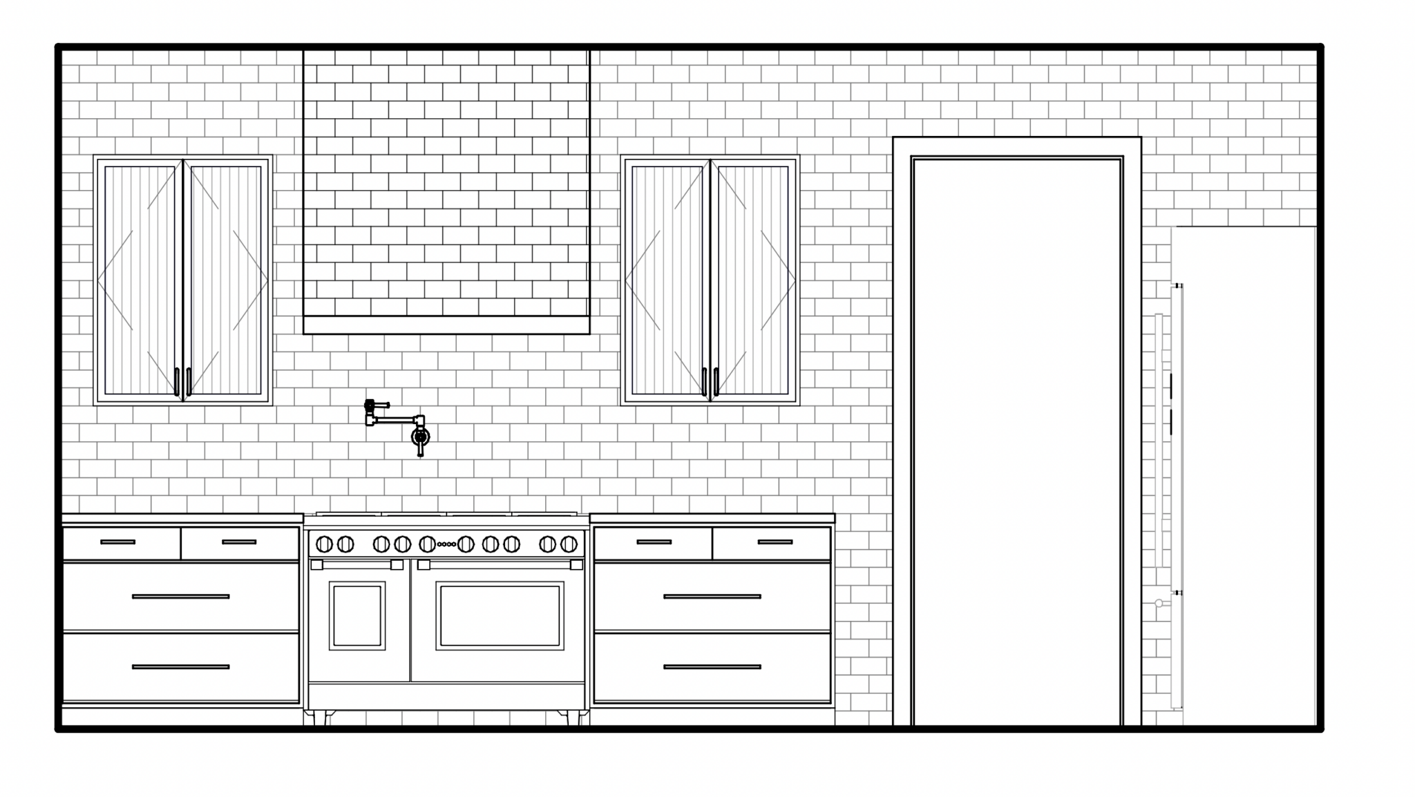
Here’s the first draft of the main kitchen stove wall and then the more flushed-out cad version. As you can see we’re planning on a pretty clean layout with plenty of breathing room around the section of upper cabinets. There’s more storage opportunities elsewhere in the kitchen so this area didn’t need to be maxed out. And we’re going big with tile by taking it up to the ceiling and wrapping the hood. Until we go tile shopping it’s anyone’s guess as to what the final look will be. Will we pick out a white subway tile or will it have some pattern? Or a bold color even? And what do you think the cabinets are going to be… all wood? painted? METAL? I sure as hell don’t know.

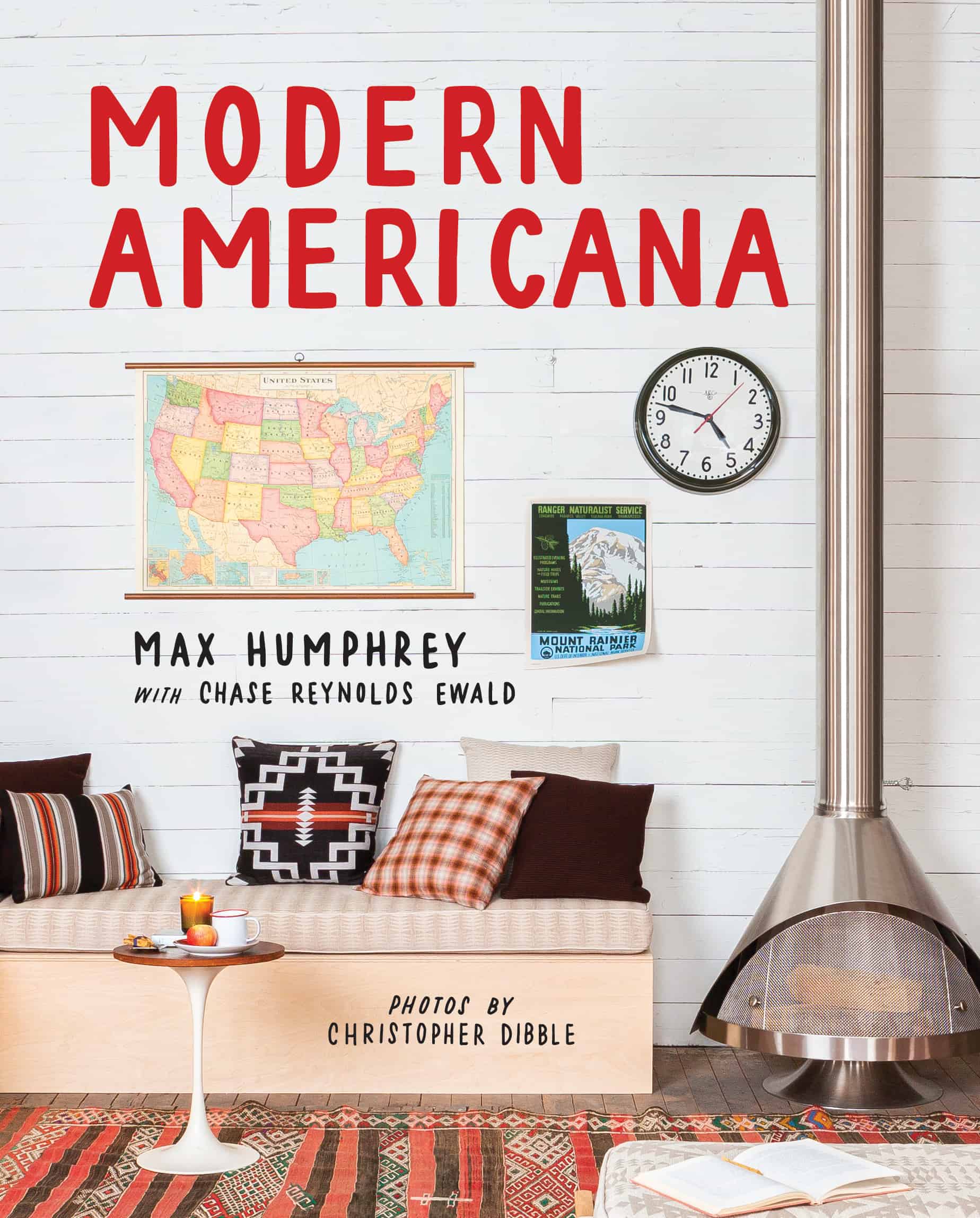
Green Snoopy Sweatshirt | My Book
As you can see I have my process. Emily has hers. You have yours. Some people are mood board people. Some pin the night away. Maybe you’re like me and just figure it all out as you go and design entire rooms based on button-up denim shirts. The point is there’s no “wrong way” to design. AND btw by the time I hit “save draft” and gave Jess and Emily a heads up that I was done writing this post I got an Instagram pop-up ad for another novelty Snoopy sweatshirt. Thanks everyone for reading and hopefully I’ll be back again soon sharing more River House non-inspo. And if you want to see more of my DIY vibes and design work please grab a copy of my brand new book Modern Americana HERE or at your favorite local bookseller.
*All Designs by Max Humphrey
**After Photos by Christopher Dibble
The post The House That Pinterest Won’t Build (Em’s River House Co-Designer, Max Humphrey Refuses To Look At Her Inspo Board) appeared first on Emily Henderson.